

From the Trenches is a Blastra series featuring practitioners solving real problems at work - one shot at a time.
After a while, you stop needing to see the traffic numbers to know whether a launch is going to land. You can tell from the product page itself. It's difficult to say how successful a launch will be, but I can usually tell right away if it won't succeed. Here's my list, some are page-level details, some are bigger strategic calls.
Where Launches Go Wrong
1. You can't explain it to a kid
If you can't describe what your product does in a sentence a ten-year-old would understand, you're already in trouble. Sounds obvious, but most submissions fail it.
If you don't have a ten-year-old nearby, here's a test I'd recommend: open an incognito Claude session with no context and no history, paste in your landing page, and ask it to tell you what your product does. If the answer comes back vague, confused, or just repeats your own buzzwords back at you, that's what a real visitor's first impression looks like too. Fix it until a cold read gets it right, and keep it simple.
2. The value prop isn't in the one-liner
The value prop needs to be sitting right there in your one-liner, the very first thing anyone reads. I see a lot of launches where the real value is explained three paragraphs down, after a founder has already lost most of the room. If someone has to keep scrolling to find out why they should care, the launch is lost.
Good one-liners:
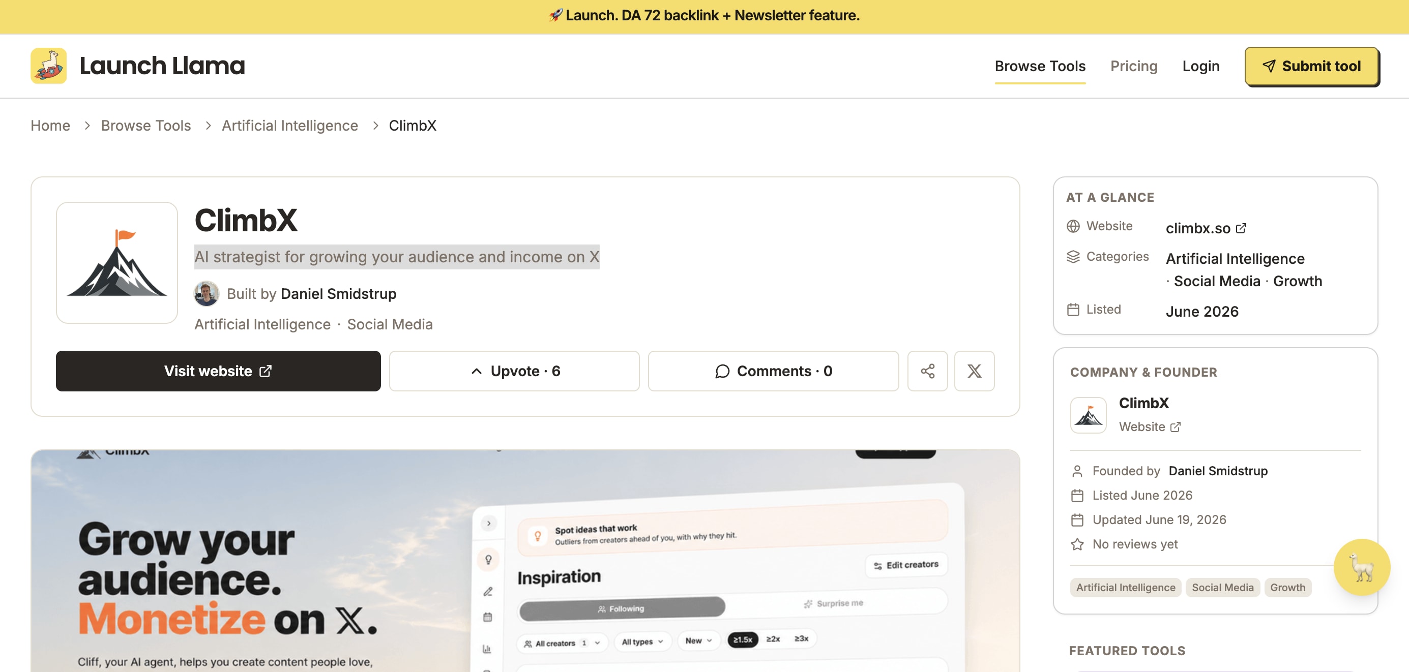
- "AI strategist for growing your audience and income on X": in one line it tells you the category (AI strategist), the platform (X), and the payoff (audience and income), so a visitor knows exactly what they're getting before reading further.
- "Get your invoices paid 2 weeks faster, without a single follow-up email": a specific outcome (2 weeks faster), a specific pain removed (no more chasing), and it's obvious who this is for within one read.
- "Turn your messiest spreadsheet into a dashboard your team actually reads": names the exact starting problem (a messy spreadsheet) and the exact result (a dashboard people use), so you already know if it applies to you.
Bad one-liners:
- "The next generation of productivity, powered by AI": says nothing about what the product does, who it's for, or what changes for the user. Everyone says "next generation" and "powered by AI" at this point, so it reads as noise.
- "A smarter way to work": vague enough to describe almost any SaaS product ever built. No outcome, no specifics, nothing for a visitor to hook onto.
3. You sell features instead of outcomes
The submissions that do well describe the outcome, the thing that changes for me if I use the product. "An AI-powered scheduling app" tells me nothing about why I'd want it, because it names the mechanism instead of the payoff. Good launches sell the after: what's different once you're using the product.
A few examples of the shift:
- "AI-powered scheduling app" → "Never send another 'does Tuesday work?' email"
- "Automated invoice software" → "Get paid 2 weeks faster, without chasing anyone"
- "AI writing assistant" → "Turn a rough voice note into a finished blog post"
- "Analytics dashboard for SaaS" → "Know exactly which feature is making you money"
- "AI resume builder" → "Get past the recruiter's 6-second scan"
4. No social proof, anywhere
I see far too many landing pages with zero social proof on them at all, and it's such an easy fix: embed it everywhere you can. Star ratings, Google reviews, the Stripe logo, logos of companies you've worked with, anything that builds trust. It doesn't need to be one big "as seen in" banner. The launches that do well scatter proof throughout the page, so wherever someone lands, there's something telling them other people already trust this.
5. No frictionless way to actually use it
This is a huge one. The route from the landing page to a free trial or payment has to be direct and heavily optimised, with nothing that resembles spaghetti code in between.
Your site should be built around one action you want the visitor to take, with a customer journey map built around getting people to it.
6. No face behind it
People trust a face. Include your socials or a way to contact you directly on the page. I've had thousands of founders get in touch with me over the years asking for tips and ways to improve their launch, and that only happens because there's a real person on the other end.
7. Don't be everything for everyone
Niching down is mega important, especially in the age of AI when everything is getting hyper-personalised. The launches that blur their audience to sound bigger always perform worse than the ones that pick a specific person and speak directly to them.
None of this is unique to launch day, either. The same product page keeps working, or keeps failing, on every other directory and marketplace you end up listed on, long after the traffic from week one has dried up. Get it right once and it pays out everywhere your product shows up.
Related Reading
- Two Months on AppSumo: How Our Refund Rate Went From 33% to 5% — Islam Midov on what a 60-day refund window does to a product, from the other side of a launch
- Top Places to Launch Your Startup — A ranked list of launch platforms, from Product Hunt to BetaList, with traffic stats
- What Are Software Directories (and How They Differ From Marketplaces) — Why a launch platform and an ongoing review directory solve different problems
- Directory Submission Strategy as a Competitive Moat — Why a managed third-party presence is hard for competitors to copy
Launch day ends. The listing doesn't.
Blastra manages your presence across G2, Capterra, SourceForge, and dozens of other directories, each listing fully built out and optimized for AI answers (AEO), so the page keeps converting long after opening week.